Melio · 2024
Pay a bill with every detail it needs.
I was the design manager: I led the creative direction, UX and research, with a product designer from my team.
In short
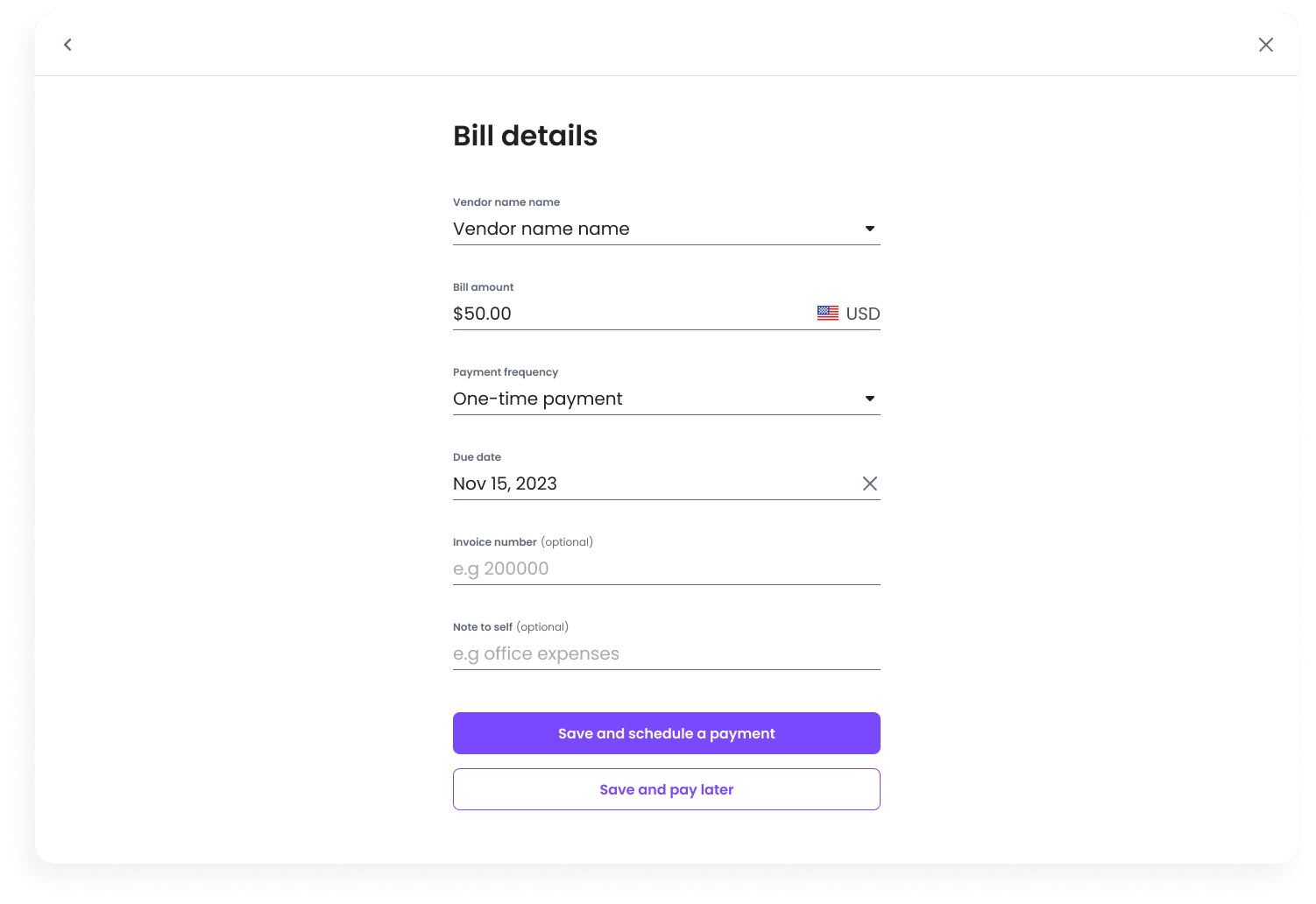
The bill flow is the heart of Melio: users pay vendors from a bill's details, once or on repeat. The old flow was basic. It couldn't take attachments, scan a bill, or hold line items, categories and classes, which accountants use every day in QuickBooks.
How I worked
I set the direction and ran the research with a designer from my team: competitor analysis, layout exploration, and interviews with 7 dedicated users. Their feedback shaped what we added before the A/B test.
The challenge
The basics were there. The details weren't.
No attachments
Bills couldn't carry the original file.
No scanning
Every detail was typed by hand.
No line items
Categories and classes lived only in QuickBooks.
Behind competitors
Top tools already showed the bill beside the form.
Research
Most products put the bill beside the form.
We mapped the end-to-end flow and analysed competitors' patterns, sorting must-haves, nice-to-haves and things to avoid. The clearest pattern: a side-by-side bill preview that scales and lets people work their way.
Fill bill details manually
To who?
Vendor nameFor what?
Dates created and dueInvoice #LocationMemoHow much?
AmountorLine itemsLine item details
Optional
DescriptionClassCustomerBillable, yes or no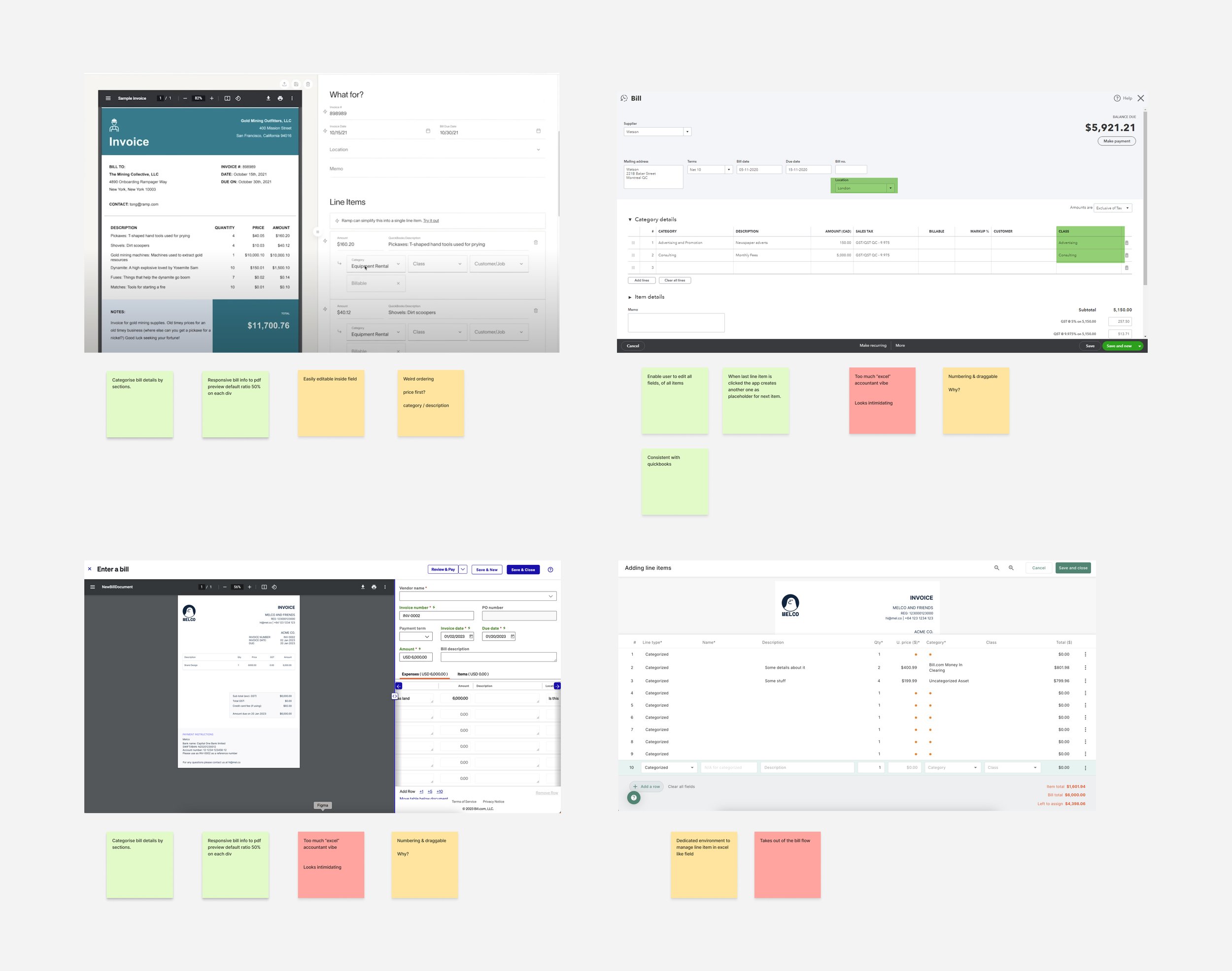
The work
How it came together.
01
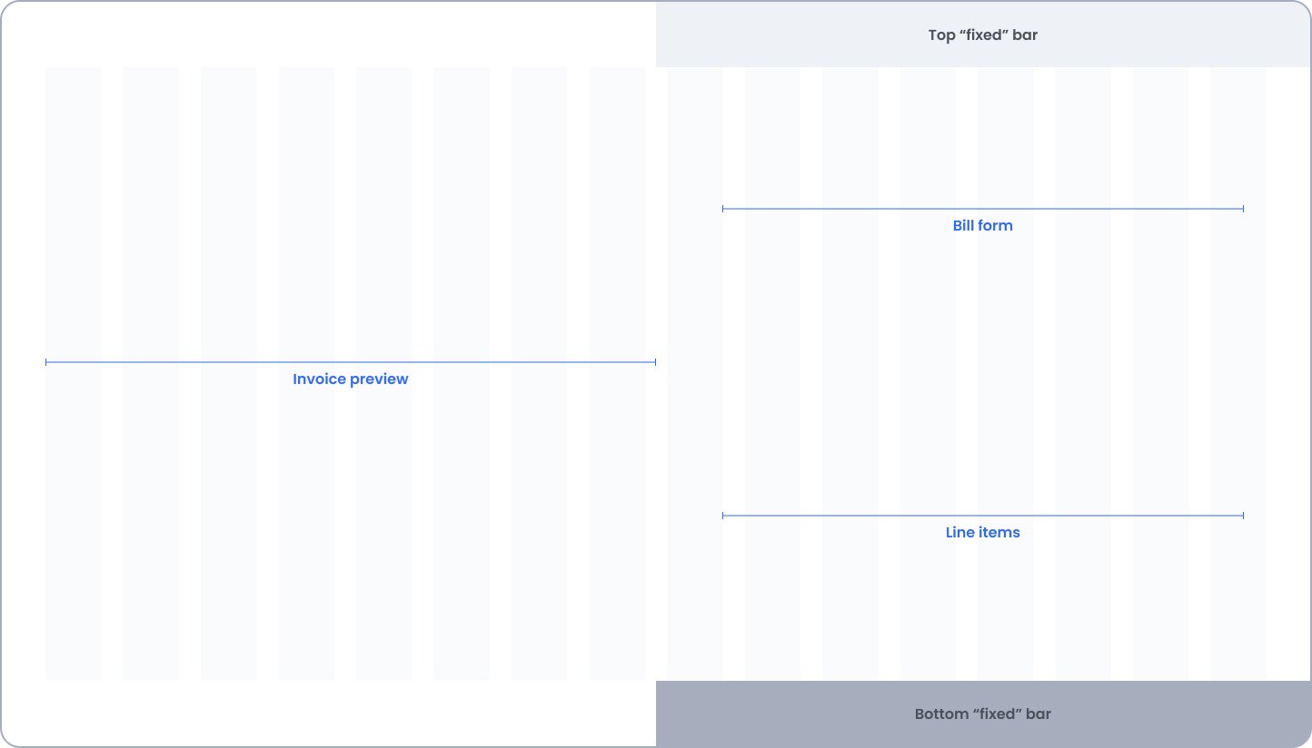
Side by side, after many iterations
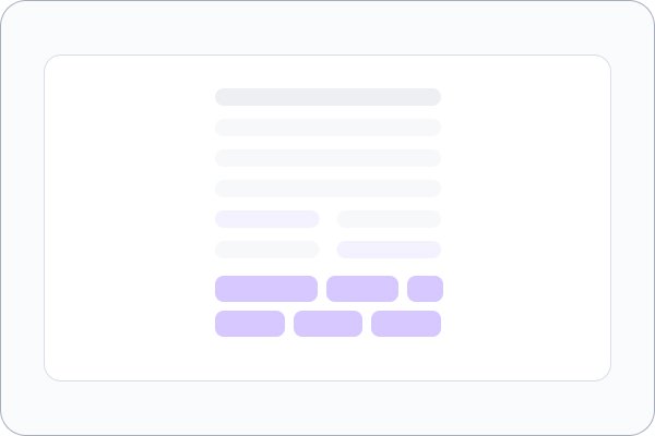
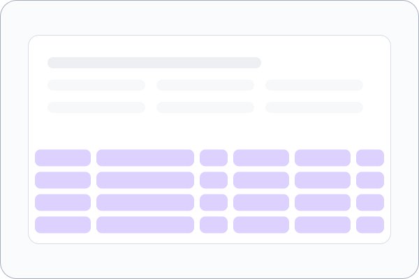
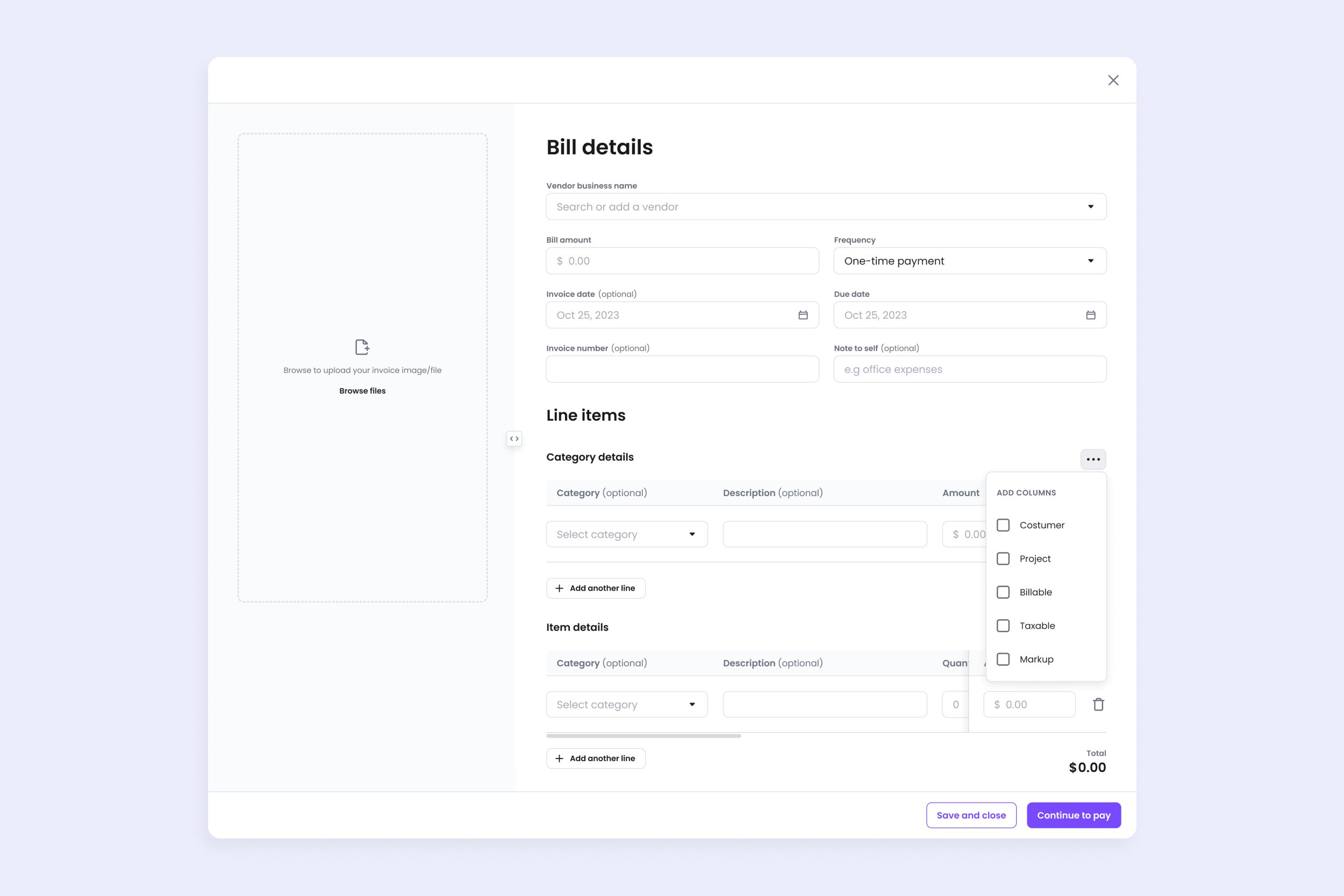
We weighed task efficiency, cognitive load and navigation across layouts. Side by side won: the bill preview can grow for scanning, the form stays as simple as before, and line items fit in without crowding it.
02
Built from what users asked for
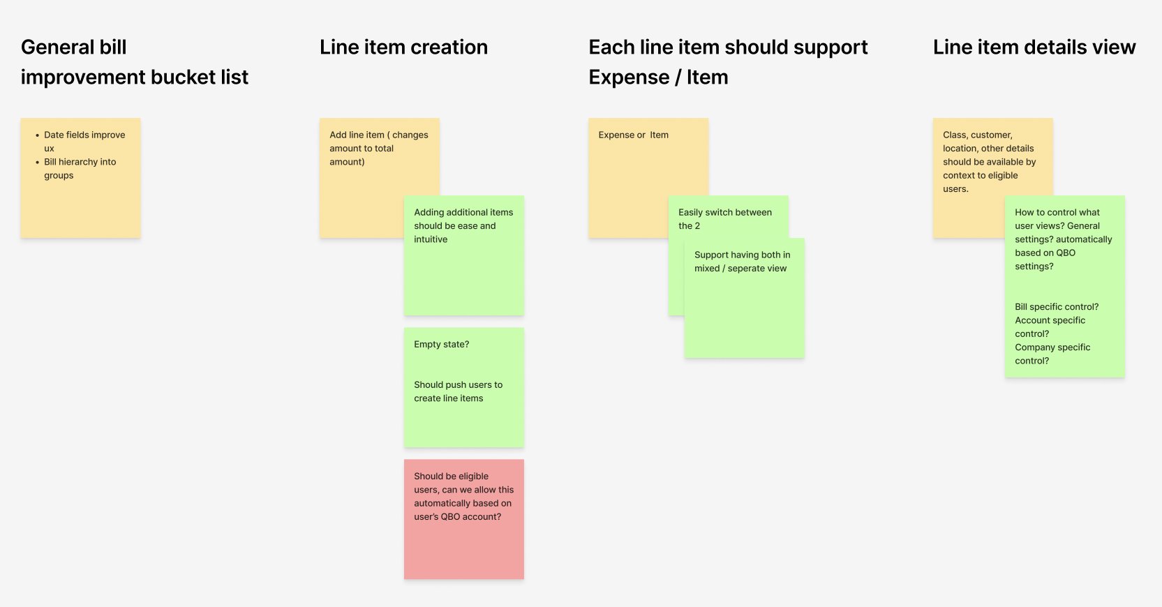
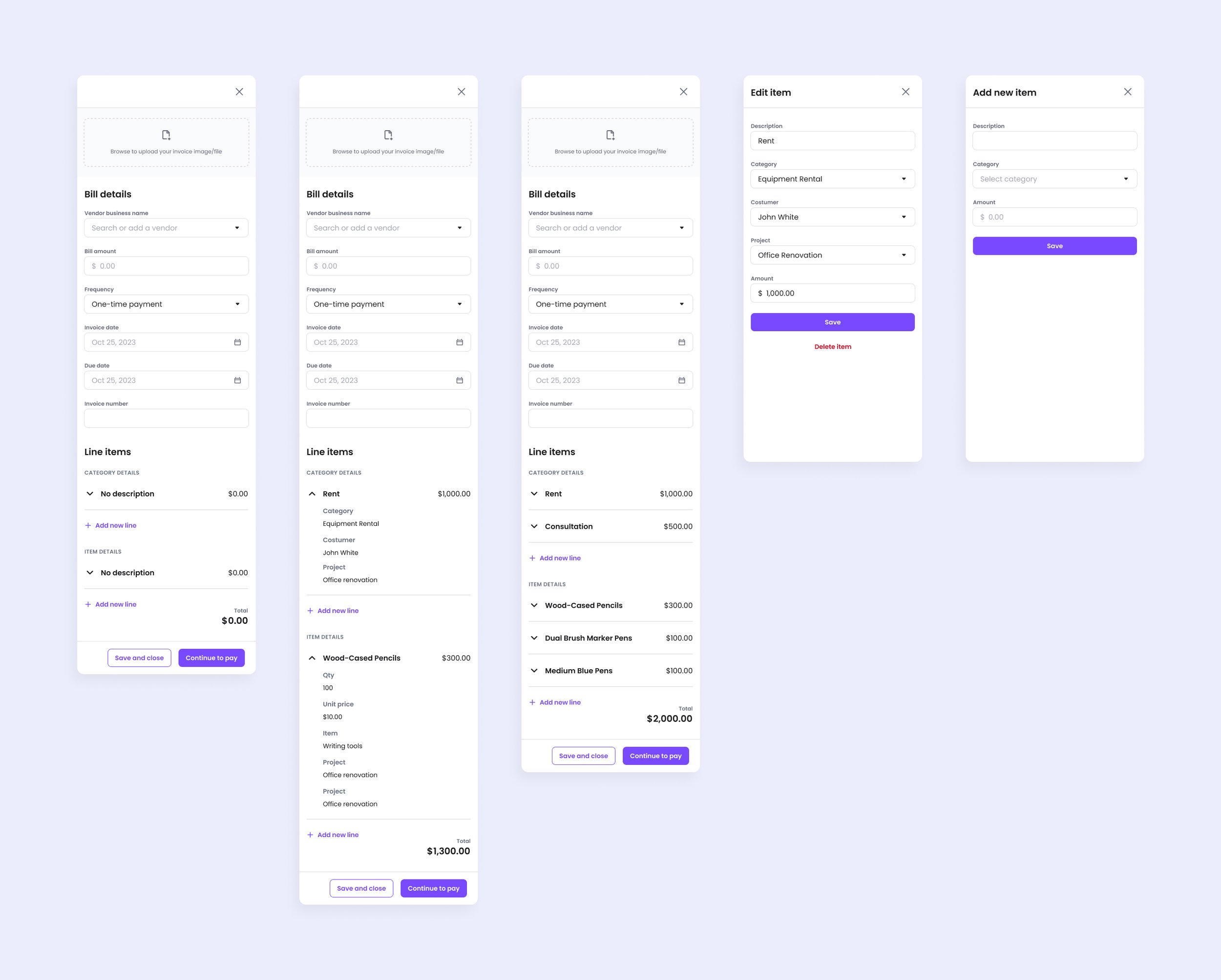
We interviewed 7 dedicated users through Gong. The biggest issues were responsiveness and inputs V1 was missing, and 5 of the 7 asked to add and remove fields to fit their own work. We addressed that feedback before launch.
Results
A small lift, then a full rollout.
- The lift held, so we opened the new flow to everyone and kept testing
- We tracked time on site, bills created, MAU and first-time payments
The final design
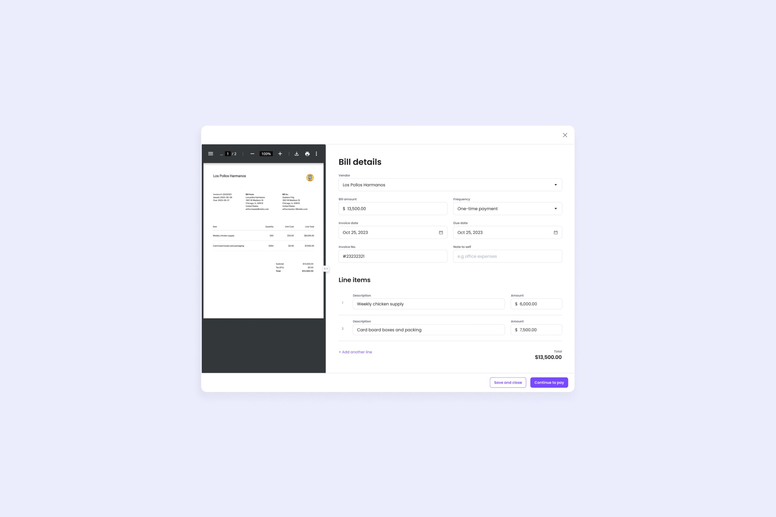
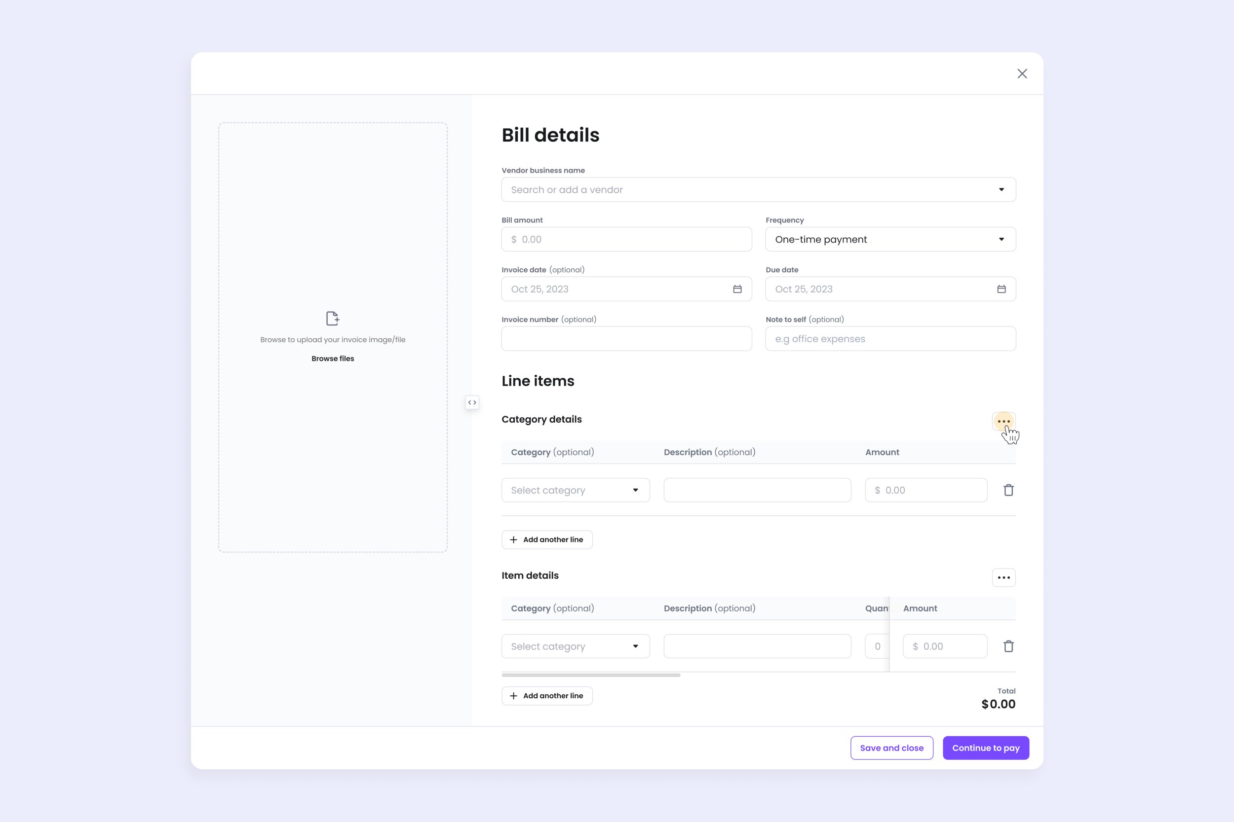
What shipped.
Looking back
What I'd do differently.
Test with accountants earlier
Accountants drove the need for line items. I'd bring a few into the layout exploration, not only the interviews after it.
Let the A/B run longer
We saw a slight lift in 3 months. A longer test, or more users in it, would have made the result easier to trust.
Design field customising from day 1
5 of 7 users asked to add and remove fields. I'd plan for that in the first version instead of after testing.